In this article, we are going to discuss 3 types of charts that are very useful in machine learning, data analytics and statistical analysis. They are, namely, histogram, box chart and heatmap. These chart types allow the user to explore data distribution, identify trends and visualize correlations
Histogram
A histogram is a type of bar chart that represents the distribution of numerical data. It is used to visualize the frequency of data points within specified ranges, known as bins. Each bar in a histogram represents the count or percentage of observations that fall within a particular bin. This makes histograms a powerful tool for understanding the shape, central tendency, and variability of your data¹².
Histograms are particularly useful for identifying patterns such as skewness, modality (e.g., unimodal, bimodal), and the presence of outliers. They are commonly used in statistics to provide a visual summary of large datasets, making it easier to see how data is distributed across different intervals.
In EspressChart, a histogram is basically a column chart or bar chart with the histogram format options applied. An example is shown below.
First, you select the variable that you want to apply histogram format and make it the category axis.
In this example, we use a dataset of different make of automobiles with various attributes. We want to see the distribution of the weight of the vehicles. Select “None” for Data Series. Category (X axis) is “curb weight” and the rest of the fields in the Data Mapping dialog are not important.
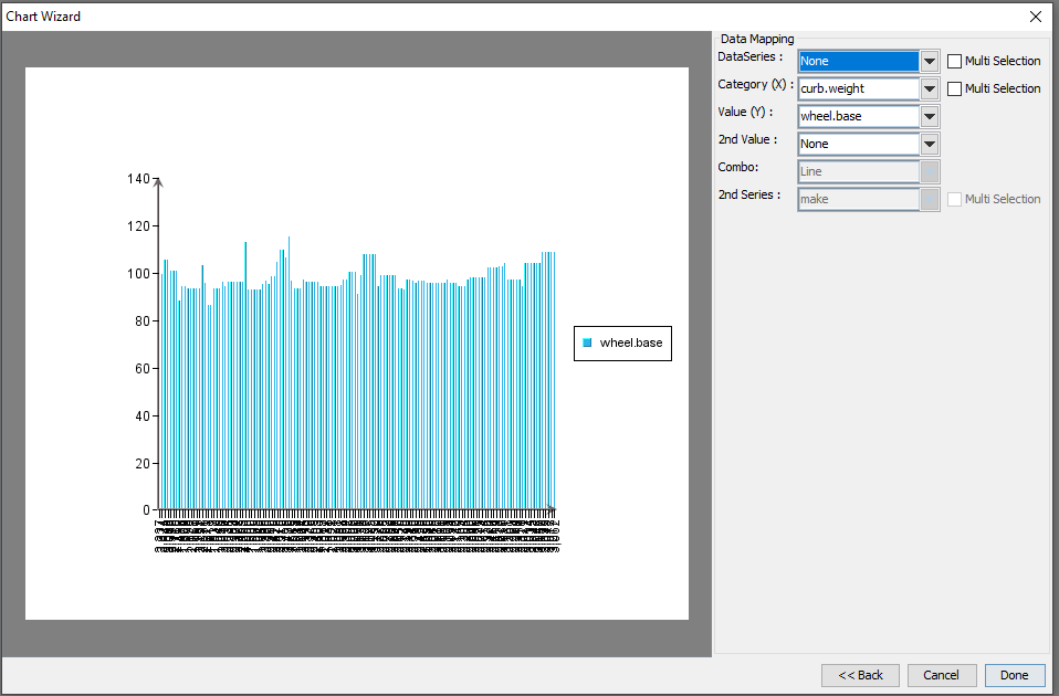
Next, after you click “Done”, choose “Histogram Options…” under Format.
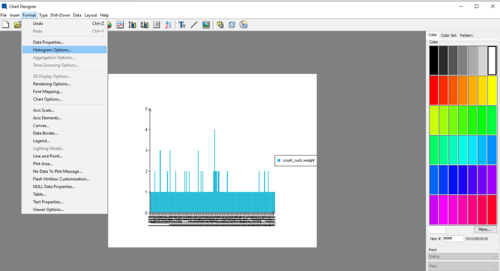
This histogram chart will be displayed as below.
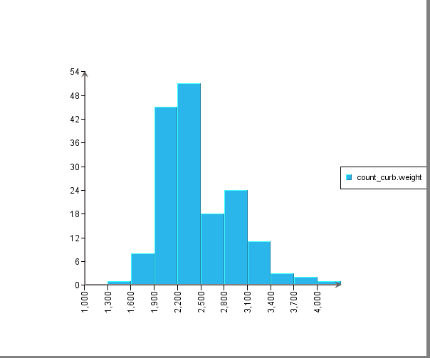
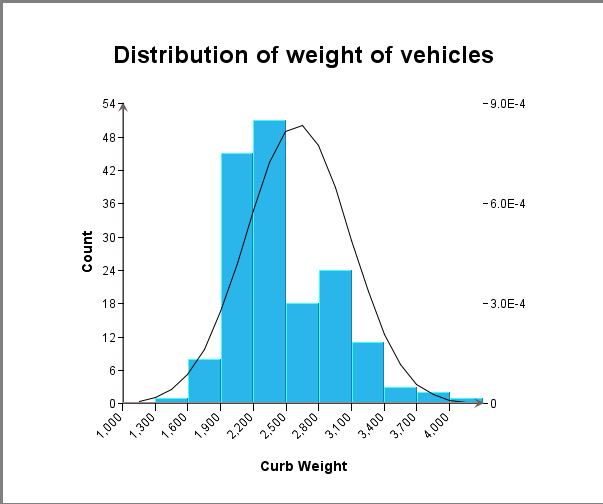
Next, apply desired formatting to get the following histogram chart.
Notice that a normal curve is (optionally) inserted as a trend line to show if the distribution approximates a normal curve.
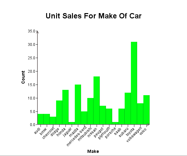
EspressChart also allows the Category axis of a histogram to be a categorical variable, i.e. non-numeric. In this case, the histogram is essentially performing a “group by” on the data. The following is an example.
Box Chart
A box chart, also known as a box plot or box-and-whisker plot, is a graphical representation used to summarize the distribution of a dataset. It provides a visual summary of the data’s central tendency, variability, and skewness, and is particularly useful for identifying outliers.
Key Components of a Box Chart:
1. Minimum: The smallest data point excluding outliers.
2. First Quartile (Q1): The median of the lower half of the dataset (25th percentile).
3. Median (Q2): The middle value of the dataset (50th percentile).
4. Third Quartile (Q3): The median of the upper half of the dataset (75th percentile).
5. Maximum: The largest data point excluding outliers.
6. Whiskers: Lines extending from the box to the minimum and maximum values.
7. Outliers: Data points that fall outside the whiskers, often marked with dots or asterisks.
Why Use a Box Chart?
– Comparison: Easily compare distributions across different groups.
– Outliers: Quickly identify outliers in the data.
– Summary: Provides a concise summary of the data’s distribution.
Box charts are widely used in exploratory data analysis to provide insights into the data’s structure and to compare different datasets effectively.
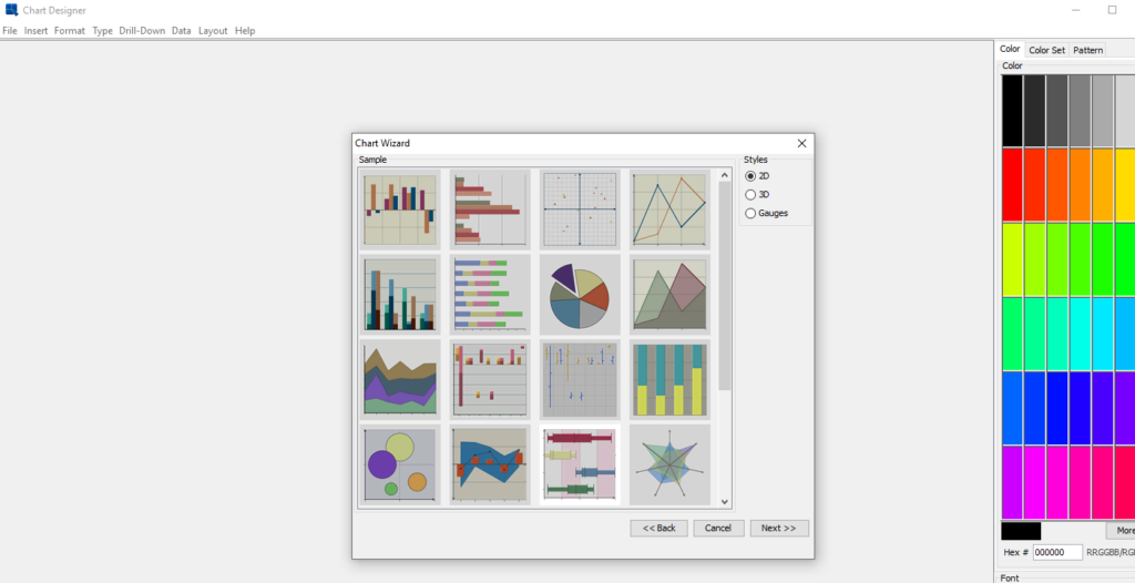
To create a Box Chart in EspressChart, simply click on the Box Chart icon in the Chart Wizard once data source is selected.
Then do data mapping by selecting the data column for the Category axis and the Value axis.
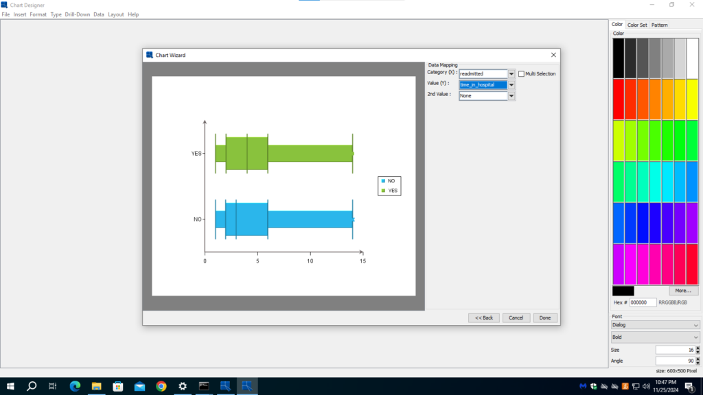
Click done to move to the next steps to format and put on finishing touches on the chart.
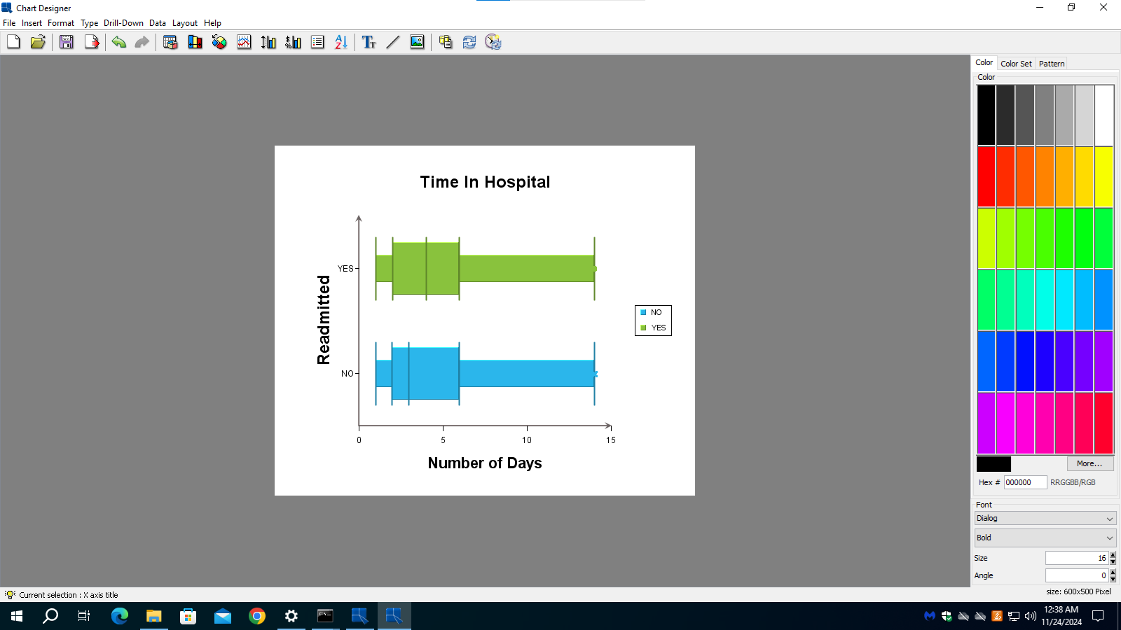
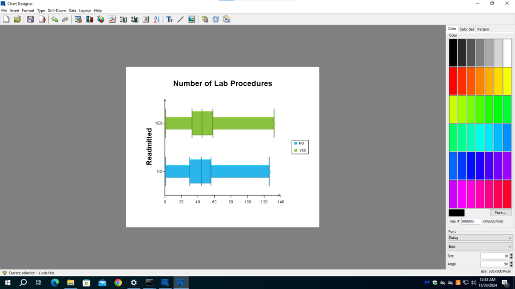
In this example, the data set consists of attributes of diabetic patients and whether they are readmitted to the hospital. From patient care point of view, the hospital would like to see that patients do not need to be readmitted. We can see the correlation between readmission and an attribute in a box chart. In the two charts below, we can see that “time in hospital” correlates with readmission. Whereas “number of lab procedure” has no correlation with readmission.
Heatmap
A heatmap is a data visualization tool that uses color to represent the values of a matrix. This method is particularly effective for displaying large amounts of data in a way that is easy to understand at a glance. The colors in a heatmap typically range from cool (e.g., blue) to warm (e.g., red), with each color representing a different value or range of values. This visual representation allows for quick identification of patterns, trends, and outliers within the data.
Heatmaps are widely used in various fields, including biology, finance, and marketing. In biology, for example, heatmaps can be used to display gene expression data, where different colors indicate the level of expression of various genes across different conditions or samples. In finance, heatmaps can help visualize stock market data, showing the performance of different stocks or sectors over time. In marketing, heatmaps are often used to analyze website user behavior, highlighting areas of a webpage that receive the most attention from visitors.
Creating a heatmap involves several steps, starting with data collection and preparation. The data must be organized into a matrix format, where each cell represents a specific value. Next, a color gradient is chosen to represent the range of values in the data. The heatmap is then generated by mapping each value in the matrix to a corresponding color in the gradient. This process can be done using various software tools and programming languages, such as Excel, R, Python, and specialized data visualization software such as EspressChart.
Overall, heatmaps are a powerful tool for data analysis and presentation. They provide a clear and intuitive way to visualize complex data sets, making it easier to identify important patterns and insights. Whether you are a researcher, analyst, or marketer, understanding how to create and interpret heatmaps can greatly enhance your ability to make data-driven decisions.
The following is an example of a heatmap created with EspressChart.
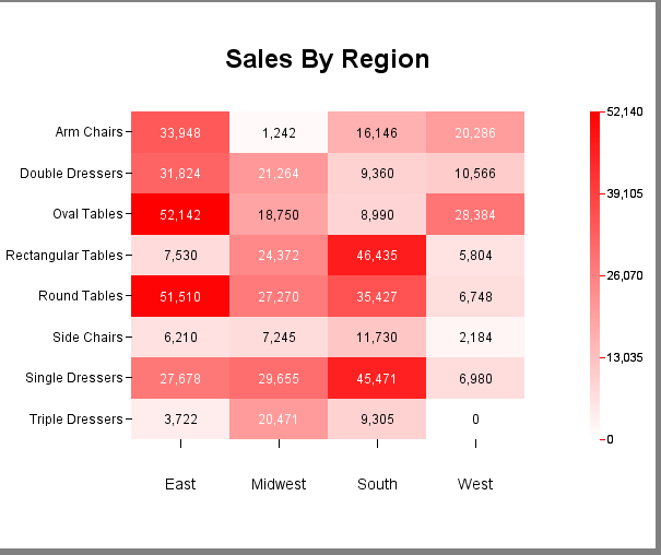
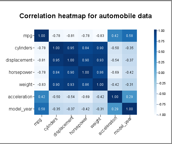
In addition to just plotting (X,Y. value) straight from the input data, there is a correlation option that you can apply to the data. As such, you can easily visualize the correlation coefficients between pairs of columns from the data source, i.e. each entry in the matrix is the correlation coefficient between the corresponding columns on the X axis and the Y axis. Below is an example. In this example, the columns along the X axis are the same as those along the Y axis. But they do not have to be the same.
Data mapping of heatmap without applying the correlation function is straightforward.
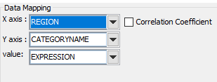
Data mapping of heatmap with correlation function applied Note that the “Correlation Coefficient” checkbox is checked, and the X-axis and Y-axis show all the available numeric columns in the data source. You can select multiple columns in each of the axes.
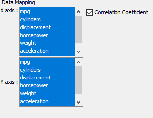
In our earlier example, we selected all the columns for the X axis and all the columns for the Y axis. But you can choose different columns for each axis.
Conclusion
To build a good machine learning model, the machine learning engineer or data scientist needs to perform feature engineering based on the the distribution of data, trends and correlation among features in the data. EspressChart supports the most popular chart types that allow the user to achieve the goal.
