
Dashboards play a crucial role in the decision-making process of many organizations. They provide a visual representation of key performance indicators (KPIs) and allow stakeholders to quickly gauge the health and progress of various initiatives. Just like a pilot will not fly a plane without a dashboard, a business stakeholder should not run a business without using dashboards. However, not all dashboards are created equal. Here’s a guide on best practices to ensure your dashboard is effective, user-friendly, and actionable.
1. Start with a Clear Objective
Before diving into design or data selection, determine the primary purpose of your dashboard. Make sure you know your audience. Are you trying to provide a high-level overview of company performance? Or, perhaps you’re diving deep into a specific department’s metrics. Be clear about the dashboard’s goal from the onset. This is when you define the most important metrics, i.e. the key performance indicators.

2. Prioritize Simplicity and Clarity
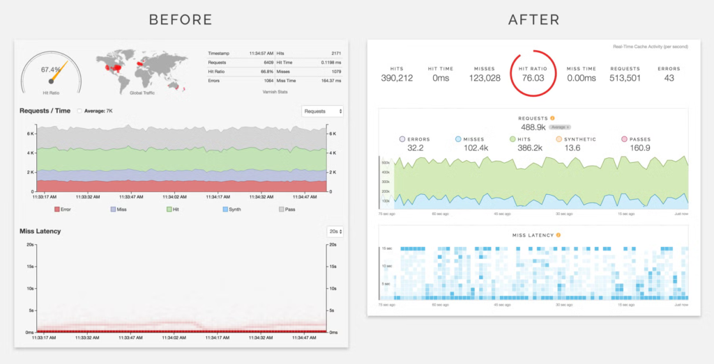
📊 Before Update:On the left below, is a dashboard for unveiling Real-Time Cache Activity from Third-Party Monitoring Tools which is crucial for operations. But some of the elements seem to leave room for interpretation mysteries. The geographical map, while visually engaging, poses questions: Is it delineating requests, error incidences due to its red coloration, or hit counts? The metrics, although present, requires a deeper dive to extract specifics. The text in the upper right corner is a bit cluttered and unclear.
The dashboard on the right is the modified version of the same data set.
🎯 Highlighted Enhancements:
- A fresh, modern color palette elevates the visual experience.
- We’ve adopted an intuitive time format—showcasing data as “Now, 15 sec. ago, 30 sec. ago, 60 sec. ago” to show that data points come in real-time, instead of using time values such as “13:00:00, 13:00:15, 13:00:30, 13:01:00”.
- The “Miss Latency” chart uses a more insightful chart type such as a heat map. It refers to the amount of time it takes to retrieve data that is not found in the cache (a cache miss) and has to be loaded from a slower, larger storage medium, such as the main memory or a hard drive.
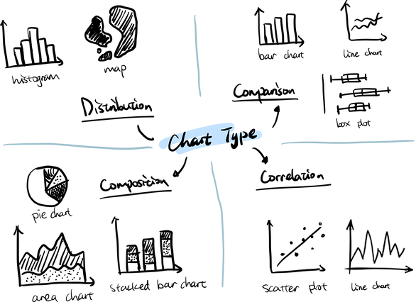
3. Choose the Right Visualizations
Different data sets require different visualizations. Whether it’s a bar chart, pie chart, heat map, or scatter plot, pick the one that communicates your data most effectively. Remember, the objective is clarity. For instance, use a scatter chart if you want to show the correlation of two variables; use a line chart or column chart to show trends, use a box chart to show statistical distribution of data.
4. Use Hierarchical Design
Place the most crucial data at the top or center of your dashboard. This follows the natural reading patterns and ensures that the most important information is seen first. Hierarchical design also means utilizing the drill down functionality. In a nut shell, elements in the dashboard show summary data. The user can click on data points and drilldown to see details. For example, a pie chart shows the overall sales in each geographical region. The user can click on a region (sector of the pie) and drilldown to see the sales details in a report in that particular region. In EspressReport ES, you can define the drilldown when designing the dashboard, or you can design the drilldown in the individual element. For example, consider the pie chart mentioned above. When you add the pie chart to the dashboard, you can define the drilldown such that the data points “region” would be used to drilldown to the next level and that the element the user drilldown to is a report. But this report can be one with drilldown features embedded in it. So that the user can click on a certain data point in the report and drilldown to yet another level to see more detailed information. Another feature in the dashboard designer in EspressReport ES is that when the user click on an element in the dashboard, it can drilldown to another dashboard.

5. Make It Interactive
You can make the dashboard interactive by adding drilldown, filter parameters and element linking features. Interactive elements can help users uncover insights that static visuals might miss. As such, these capabilities can make your dashboards more valuable and actionable.
6. Optimize for Mobile
In today’s digital age, many professionals access dashboards on-the-go. Ensure your dashboard looks as good on mobile devices as it does on desktop.

7. Update Regularly
An outdated dashboard is of little use. Automate data updates if possible. For example, make the dashboard always load fresh data on demand, or set up scheduled data refresh. Also regularly review the metrics you’re displaying to ensure they remain relevant.

8. Gather Feedback
Once your dashboard is live, gather feedback from its primary users. They may provide insights on usability or additional data that might be helpful.

Conclusion
In conclusion, dashboard is an indispensable data analytic and data visualization tool for stakeholders in an organization to run the business. It is therefore worth the extra effort to make them insightful, actionable and easy to use.